Landing Page Hacks!
- Areeb Sanadi
- Dec 22, 2020
- 4 min read

Designing great landing pages is a sure-shot way to propel your product to the next level. There are 5 important elements that every high-converting landing page contains.
Landing pages are a bit different compared to your usual web page in that it is hyper-focused on one goal: Getting the user to convert/take some sort of action such as a signup, sales call, purchase or request a demo. It is more of a page where you would want to re-direct your traffic and usually you bring people in through Ads, affiliate marketing, pay-per-click marketing funnels.
Key focus still needs to be the content that is displayed on your landing page, which has to be curated keeping in mind a specific goal that can pursue people to initiate a convertible action.

An example to translate that:

Given their purpose, special attention needs to be given to these five elements:
Value proposition
Have very powerful message capturing users attention.
Articulate clearly for what's in it for the user.
Call-to-action
Strong insight flow on what to do next
Basic detailing for the user to drop email/signup vs a lengthy form
Maintain attention
Make sure they do not have any other distractions so that there attention does not get diverted and is focused on conversion.
Keep a bigger picture in mind, rather than getting into the intricate details.
Limit length of the page; only include critical and required information.
Visuals
Strong visuals to drive the product/conversation and reinforce the vision
Explain what they are signing up for.
Have relatable emotions attached to it to create a strong bond and higher conversion rates.
Social proof
How other people are using it. Feedback/Reviews are always a good start.
Use the social emotion to create trust
Add logos/numbers/testimonials
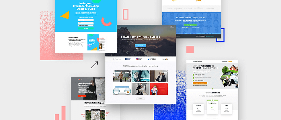
For better understanding as to how these elements can be incorporated let us look at some examples.
Checkout shopify.com : The landing page is clean, crisp and allows 14 days of free trial with just an email ID and no credit card details required. AD's and other links would divert the users here. If you see there is a clear focus on sign ups and trail, not a lot of navigation required and lets you know all the key features(Value Proposition) as you scroll down. Clear articulation of what they do , what they can help you do and providing social validation such as trusted by a million businesses an eye catching number. They also have a call to action at the top and call to action at the bottom making it easy for the user if he traverses to go through all the content.
Webflow.com : They do not have a navigation menu as soon as you land on their website . You can get started by clicking on the single button on the page with "its free" writing while having articulate messaging conveying their value proposition. The visuals show a great story of how they are building websites as well as top it with the brands and logos who are clients and collaborators. So all in all they have clear focused value proposition, great call to action and social proof for the same. The top of the website was built to give the user a landing page experience while using the same page as a normal website when we scroll through.
Lets hit netflix.com , which is one of my favorites. If you aren't logged it and it is not cached it takes you to the landing page. This does not have a menu bar, with just a sign up button. Here Netflix offers you a value proposition by giving you a month of free trial and showing how cheap its services are. It also uses its content listing to create a nice little collage of their offerings to entice the user visually. Factoring in 100%, having the experience on multiple platforms like TV, Phone, Tablets as well as multiple users hits the nail on the coffin. They have a pretty short page with key feature details wrapping it up with a FAQ and signup below which is crisp and well-articulated. The FAQ here does the part for social proof as it goes to show multiple users might be having these doubts and also now that they've become a big brand and a business they no longer need to rely on this.
Hootsuite : The tagline "The best way to manage social media" being the focus. Again lack of navigation on the page keeps users away from any distractions and all the attention if focused on the value proposition. They have used "see our plans" button as a call to action with a visual representation of how there tool works to schedule posts. They give more insights on the pricing and features when you scroll below. On-clicking the pricing they take you to their different plans suitable for you which is another landing page and gives you option for a 30-day free trial to create trust and entice the user to get used to the flow of their product.
To be honest if I put it in a way that your sales volume will not meet your expectation even if you got the best website in the world ranked high on Google!
Sounds Bizarre?
Trust me it's not!! Landing page does matter, because your website works as a doorway for billions of people on the World Wide Web.
Exciting isn't it! But it can be daunting too, so to make it all work and for the visitors to not go back from your site the top 5 hacks would definitely come in handy.
Treat them as your lead magnets to help growth hack your landing page’s conversion rate.
Written By: Areeb Sanadi & Kashish Pahwa


Comments